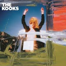
This is usually done as an advertising plan, so that viewers make subconscious links between the two and are more likely to recognise the album as that bands.
For all of these websites and CD covers there is a clear link.
The best example of this is with the Wombats. There is a similar colour background in both, the same writing for the album name, with the same band logo. The Fray's link is more discrete, as they have similar colour themes, with the same band logo, however everything else is very different.
The Kooks have the most insignificant link, however they do follow a similar colour pattern as they both use light, pastel colours. Personally, I think that the Wombats band website and CD look the most effective.
This is important to remember when we make out digi-pack and band website. We need to ensure that there is a clear link, with similar colour schemes, photos and text styles.


