Following the audience research that we conducted for the music video, we decided that the information that we received was invaluable. Therefore, we decided to do the same for out website.
Again, we asked a group of our peers to give us feedback.
This is what they said;
Success;
Clearly communicates with the reader,
Links well to the main music video,
Relevant information for a homepage,
Good understanding of industry conventions (SoundCloud links, Twitter links etc.)
Improvements;
When the music video has been finished, embed a link to YouTube- We had already planned to do this.
Ensure there is a clear relationship between the tone of the photos and the 'feel' of the video,
This week we finalised a rough cut of the performance aspect of our music video. We then showed it to a group of peers and asked for their feedback; what they thought we had done well, and what they thought we could improve on.
This is what they have to say;
Success;
Footage well edited and suited the song,
Believable performances from the band,
Good use of camera and a range of shots,
Framing has been well thought about,
Good knowing humour used throughout.
Improvements;
Improve the first few seconds as it is slightly jumpy,
Consider lighting and how we can use post production to improve it,
Consider making some of it black and white,
Use extra "behind the scenes footage" for the ending.
The Kooks' CD covers vary dramatically. They have sometimes shown the band members (which is a feature of pop bands) and other times they have used iconography or obscure images (which is a feature of indie bands).
From looking at these examples, it is clear that they follow the melancholic feel of many Indie bands/artists, and the artists are never the main focus, as if they are in the photo there is always a large open space.
This has helped us to come up with a few ideas for what we can do for out digipak.
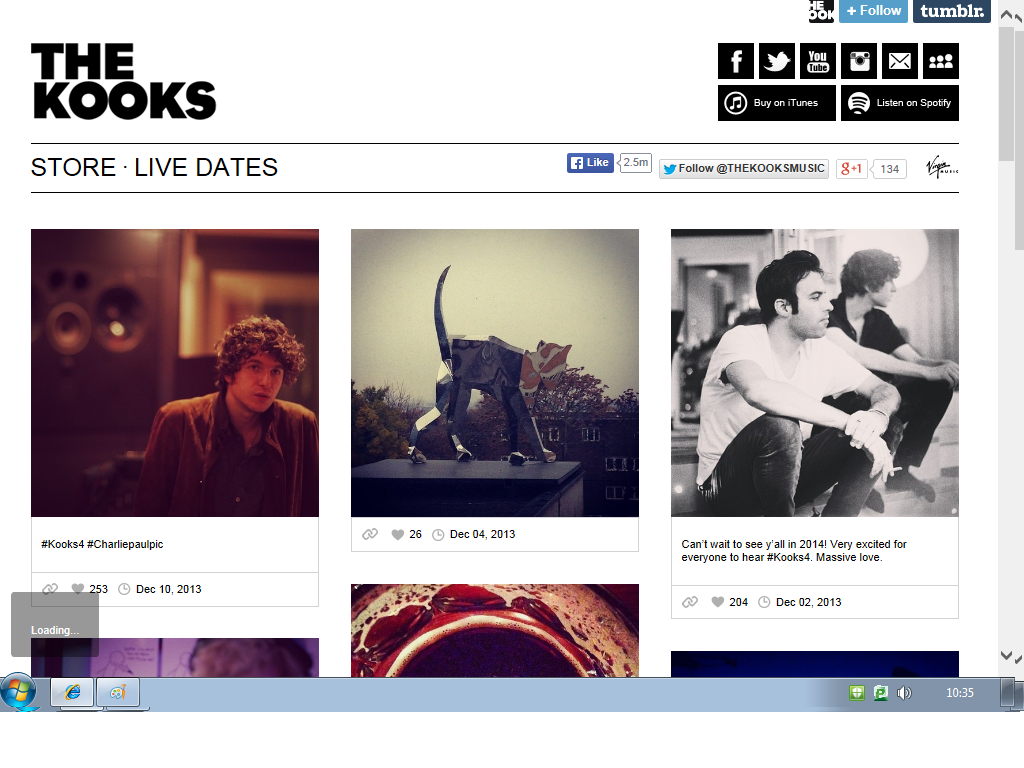
This is the band website for The Kooks. It is very minimalistic, with light colours. It has links to there store where there merchandise is sold (t-shirts, accessories, jumpers), and to their tour dates. It also has a logo of there record label in the top right corner, along with links to there social networking sites. This website allows you to like the Kooks facebook page, and follow them on twitter, straight away. This is convenient as it will not direct the viewer, and will keep them on the website for longer. The main feature of the website is the photos. They are all photos of the bands, and it looks as if they are from their tour and recording studio. This is good as it allows the fans to feel involved with the Kooks journey.
For many bands they have links between the CD style and the style of the websites.
This is usually done as an advertising plan, so that viewers make subconscious links between the two and are more likely to recognise the album as that bands.
For all of these websites and CD covers there is a clear link.
The best example of this is with the Wombats. There is a similar colour background in both, the same writing for the album name, with the same band logo. The Fray's link is more discrete, as they have similar colour themes, with the same band logo, however everything else is very different.
The Kooks have the most insignificant link, however they do follow a similar colour pattern as they both use light, pastel colours. Personally, I think that the Wombats band website and CD look the most effective.
This is important to remember when we make out digi-pack and band website. We need to ensure that there is a clear link, with similar colour schemes, photos and text styles.
Band websites are all laid out in different ways.
Here are a few examples;
The Fray
The Kooks
The Wombats
The Levellers
A key feature of the page layout is to have the band name a the very top. Also, to have either a music video or band photos. The wombats also have the name of their new single in bright bold writing, clearly done to advertise it. The Fray have a picture in the background, which moves slightly to make the page more interactive. Each band website is individual to the band, and have an underlying theme and style throughout.
A key feature of band websites are links to their social networking sites.
They can usually be found at the top of the page, but are also sometimes placed at the very bottom.
Here are a few examples of the designs for these links;
The Kooks
The Fray
The Levellers
The Wombats
All of these are very dark, with the buttons in a white colour. On The Fray's website it also has a link to a cart, this is there so people can buy the music direct from the website.
Who is the specific audience for particular products?
How do media industries target their audience?
Follow the entire product - adverts (magazines), TV ads, album covers, YouTube views.
-Investigate my audience by researching similar bands.
Pitching the product to the rest of the group and take feedback,
Showing early drafts of work (storyboards, mock upfront copy),
Taking peer product at later stages, and then again on the finished product; "can you tell me what happened in that sequence", "what the relationship between the characters are".
After editing, make a rough cut and show people for feedback.
- Produce two copies of the ancillary task, then gain feedback on which one should be chosen.
In recent years, music videos have began to be used to help market films. This is usually due to the fact the song features in the film, but it can be an effective way to integrate advertising the film with promoting the song.
An example of this is with Paramore's music video for the song 'Decode'.
It features some shots from one of the twilight films.
The representation of women in music videos is an important issue for many people, and since the development of the music video, has been a main focus for many feminists.
Feminist, Laura Mulvey, explained how woman are presented in three ways;
How men look at women,
How women look at women,
How women look at themselves.
She also says how the audience is often forced to 'view' characters through the perspective of a heterosexual male. This is done through camera angles, often focusing on a woman's body, and by creating content that largely displays a mans reactions to events that happen to the female.
Mulvey explains that women are all too often relegated to the status of objects.
This video is a good example of how women are often over-sexualised and objectified. The focus of the females dancing, and her curves by using low angles and close ups can be seen to be degrading. This is enhanced by the fact there is a lot of use of high angle shots on the males, making them appear to be the more powerful people.
However, this is all just in the audiences perception, and in some ways can link to John Friske's theory that genre's reflect zeitgeist. In 2005 when this video was released, representation of sexualisation was accepted, and in some ways still is. Comparing this videos to other, such as Sir Mix A lot's 'Baby got Back' video, shows that objectification of women within music videos could be something that reflects popular opinion of people at that time, as Laura Mulvey produced her theory in 1987 when it was less accepted.
These Four cd covers are example of bands that would fit into the Indie genre. Only one of them have a main focus of the band and that one still shows them in relation to music ( holding guitars). They all have quitter melancholia colour, with greys, blacks and low saturation.
These three are examples of bands/artists that fit into the pop genre. They all have a strong focus on the artists with them being the centre images and the only people present. They have bright colours and all feature a lot of pinks and reds.
It has a focus on the artist. There is not much information on it as it only gives the main story. The colour of the Rollin Stones is linked to the artist (It is red, so it the writing for 'new faces 2011' and Wiz Khalifa's coat). There is no barcode on these. Both of the artists displayed on the front could fit into the pop genre, although they both have very different musical styles; Wiz Khalifa is hip hop and Amy Winehouse is jazz, soul and reggae.
NME (new musical express).
There is a focus on the artist. There is a lot more information, gives an insight into a few of the stories and bands/artists that are included. The colour of the title remains consistent (red) although it is altered slightly with there being a black outline on the left picture. Both of these have the bar code on the front picture. Both of these show artists that fit into the Indie genre, and the artists/bands advertised alongside them do too.
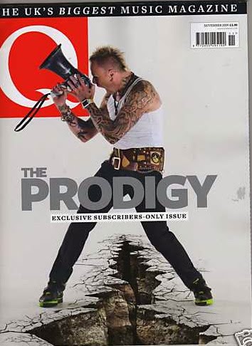
Q magazine.
Again there is a focus on the artist, however for the Prodigy cover it is not of his face, which contrasts to the others. There is much less information on the left cover than on the right, which tells the audience what will kind of content will be in it. There is a barcode included on both. It also tells the audience about the magazine as a whole 'The uk's biggest music magazine',and tries to persuade people to buy it '50-page special inside'.
In conclusion, magazine covers are there to persuade the audience to buy the magazine. By having the artist/lead singer as the main focus it will attract fans instantly. Also, by including some rufther information about the articles that are inside it can then keep a persons attention and further their interest. A running theme throughout the examples is that the magazine tends to have a certain genre as their main focus. Therefore, each magazine is aimed at people with different tastes in music.
Clothing is an important aspect in a music video, as it can help identify a band, and can add to the idea that people watch them to help create a basis for social interaction.
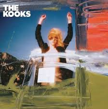
The kooks - they are wearing clothes that look slightly vintage. There's a lot of denim jackets, hats and brogue shoes.
Radiohead- they all look casual, wearing shirts and jackets. Although there is one man in the back that looks like he is wearing a suit.
All American Reject's- very casual, modern clothing. Shirts and t-shirts.
In conclusion, I have found that the most appropriate clothing for the actors within our music video will be casual, vintage with lots of denim and shirts.
As part of our research into music videos we sent out a questionnaire to 19 people, all aged between 16-18, asking them about their consumption of Indie music and how important music videos are.
(my graphs show the highest response for both gender);
Our results show that females were more like to listen to indie music, that they see music videos as important and that their opinions on a song are more likely to be influenced by a music video than males.
This will be important when it comes to planning our own music video, as it suggests who our target audience should be.


_Morning_Glory_album_cover.jpg)


 The kooks - they are wearing clothes that look slightly vintage. There's a lot of denim jackets, hats and brogue shoes.
  Radiohead- they all look casual, wearing shirts and jackets. Although there is one man in the back that looks like he is wearing a suit.


