Tuesday 1 April 2014

Question 4: How did you use media technologies in the construction and research, planning and evaluation stages?

The media technologies we used were; 

Here are a few examples of how we used them;


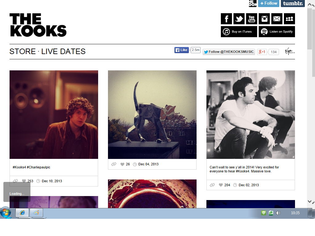
I used WIX to create the band website. This was a website i had never used before and so i had to learn how to use it. This proved challenging at first, but I believe i overcame this difficulty and produced a professional looking website. Furthermore, after i learnt how to navigate my way around the website it actually became very easy and will definitely be something i use again. Whilst using this technology we had to learn about the conventions of band websites, and what types of font, format and imagery would work best.


I used YouTube annotations for a textual analysis of a music video. It proved effective because i was able to talk about what was shown on screen whilst the audience can see exactly the same thing. I learnt how to use this technology this year and i believe it was effective way of displaying research. YouTube is an example of a web 2.0, a term that was coined in 1999 by Darcy DiNucciwhich allowed us to share our own content in a fast and easy way.

For the post production side of our coursework, we used Adobe Premier Pro. We used it to cut the shots together, to create a 'sunshine' effect on the narrative section, to create a title at the beginning and finally to change the saturation in the performance sections. Adobe is a programme that has to be bought, and therefore I had never used it before I began studying media at a-level. This year I learnt how to change the saturation within a scene to either create high key lighting or low key lighting, (although these scenes never made it into the final music video).


This year, I also developed my knowledge on effects with Adobe Premier Pro. I learnt how to alter the image, and to create a 3D looking image using lighting and titles. I used this at the beginning of our video as an introduction to the band.


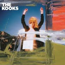
Finally, this year I learnt how to use photoshop. We decided to use this to create an image for our ancillary products, as we wanted to use something that was slightly abstract. This was because, whilst researching CD covers for Indie bands we discovered that they very rarely have images that are realistic and haven't been altered in some way. Therefore, we had to learn how to blend two images together using the opacity levels.

Another key technology that I used, especially during the research stage, was Prezi (an online presentation website). This is an effective way of presenting research in a less boring way, as it allows us to present our findings in creative ways. However, I couldn't use it for some of my evaluative questions as I discovered that Gifs do not work as a part of the presentation.

We also used two cameras during our production, these were a nikon d3200 and a panasonic camera. However, after filming our performance section we notices a difference between the quality of light each camera would let in, and the sense of depth that they both created. The nikon d3200 let in more light so created a whiter colour, and also allowed more depth of picture to be created. In contrast, the panasonic camera created a yellower and more 2D picture. Throughout the editing stage we attempted to readjust the colouring in the picture, however the difference was too strong to change completely. We considered re-filming the performance section, however this was not possible to restrictions on time for the DCAS centre.

Question 3; What have you learned from your audience feedback?


In response to our audience research, we decided to create a news report explaining what we learnt.

Audience research: finished piece.

We asked 4 people to give us their opinion on our music video.
We asked them;
  1. What genre would you say it belongs to?
  2. What audience would you say it is suited to?
  3. Is it easy to understand and follow?
  4. What improvements do you think we could have done?
  5. Does it fit with other music videos?

Question 2: How effective is the combination of your main product and your ancillary product? PART 2

Together, Misha and I created a Prezi presentation explaining how effective he combination of our music video was in comparison to the CD cover and the band website.


Question 2: How effective is the combination of your main product and ancillary products? PART 1


Part 1.

  • In our music video, the colour blue is featured predominantly. Therefore, when creating our ancillary products we attempted to create continuity with this theme by also using blue colours.

As the wall is blue in the performance section, we decided to continue this on the key features of the website; the writing and the photograph.


We added this continuity in an attempt to help the audience establish a relationship between the two products. This is important because it helps the audience identify features of the band. It is also an effective marketing strategy as the audience can easily identify the bands CD in shops and online.


A key aspect in our music video was the focus on the female character. Therefore, we decided that it would be important to keep this focus a main aspect of the CD cover.

We believe this was important because it would allow an audience to easily identify the band from the video if they had seen the CD cover, or for them to identify the CD cover if they had seen the music video.
However, as the girls face is not seen in the CD cover, the continuity may not be as effective to a  passive audience. We chose to do this because we felt it fit in better with the genre of the band (Indie), where the focus is usually not on the artists.


 We attempted to converge the ancillary products with the music video by using the same, or similar, locations. We have done this because we wanted there to be a clear link between all three products to make it easier for the audience to identify the artist and their products.

We also used the same colour scheme for the CD cover and website. There is a turquoise colour which features on both, as well as the grey background


By converging features of all three products we begin to create a brand image. This is effective because an audience are then able to recognise the band from key features, for example, photographs, the logo, colours and font. As explained by McQuail's uses and gratification theory, an audience will use these product's for a number of different reasons; to gain a sense of identification, for entertainment, to reinforces their beliefs etc. Therefore, by creating a brand image, an audience that are trying to find a sense of identification will be able to take ideas from the music video and the ancillary products and relate to them. The continuity will also add to the reinforcement of the beliefs that they may gain, for example, how to dress and act.


Question 1; part 1

In what ways does your media product use, develop or challenge forms and conventions of real media products?


Question 1; part 1

In what ways does your media product use, develop or challenge forms and conventions of real media products?


*At 7 seconds, where it says text will be displayed for three minutes, I actually meant three seconds.*


Friday 28 March 2014

Email to the Dcas centre

Today we emailed the Dcas centre to show them our final video.

Friday 28 February 2014

The Kooks - She Moves In Her Own Way: Final Music Video


This is our final music video. Enjoy.

Finsished ancillary

I have decided to use the more colourful products for our ancillary products, because I believe that it fits in better with the genre of the music. After completing research into band websites and CD covers of bands from a similar genre, the melancholic colours along with pictures not including the band, fitter better.


Here is our finished ancillary pieces;


Website...


CD cover...
Front cover. We decided to use this image because we felt it fit well with the Indie genre. It uses and abstract image that doesn't focus on the band, and also uses low saturation lighting. 


Insert 1. This included a thank you from the band and QR codes to allow the audience to easily buy the album. It also displayed the band logo, which acts as a brand sign, as well as the band website, which again can be seen as marketing a brand
   

Insert 2. This includes the credits to the production company and the band members, as well as a band photo which the audience can use to identify the band. 

This is the front and back cover of the CD. The back cover has a track listing, as well as the logos to all the websites where an audience can listen to or buy the songs online, and the record companies. We discovered that these were all features of CD covers during the research stage. 
        
The black writing at the bottom is actually turquoise (to fit in with the website) however it did not shop up on the preview.

Alternative ancillary product

This is the alternative ancillary products. We decided not to use these because we did not think that a black and white theme fitted with the upbeat song that we chose.

Website...

Ancillary products

For our ancillary products we chose to produce a band website and a CD cover.

Whilst creating them as a group, we discovered that we a difference in opinion for how each of them should look. Therefore, we decided to create two lots of each product, and to then decide which one we preferred.

Black and white;

One of the ideas we had was to have a black and white theme. Therefore, all the photos are in black and white as well as the background and text for the website and CD cover.
This set of products focusses on the band, with the photos being entirely of them, as well as having the CD cover using a full length photo of the band. We thought that this theme would fit in with the Indie rock aspect of the Kooks.
 

Colourful;

The other idea was to use melancholic colours, and a vintage looking feel. These focus on the female character within our music video, as well as using a lot of nature pictures. The website is much more colourful. However, the majority of the CD cover is black and white. We thought that this theme would fit in well with the Indi pop aspect of the Kooks, which is what genre the song is.
 

Thursday 27 February 2014

Writing for our CD cover.

Today we have been trying to find a suitable font for the writing on our CD cover.
These are our options,

Friday 7 February 2014

Filming pictures.

Here are some pictures we took during our two shoots


Narrative section. 


Performance section 

Tuesday 4 February 2014

Audience research

Following the audience research that we conducted for the music video, we decided that the information that we received was invaluable. Therefore, we decided to do the same for out website.
Again, we asked a group of our peers to give us feedback.

This is what they said;

Success;

  • Clearly communicates with the reader,
  • Links well to the main music video,
  • Relevant information for a homepage,
  • Good understanding of industry conventions (SoundCloud links, Twitter links etc.)
Improvements;

  • When the music video has been finished, embed a link to YouTube- We had already planned to do this.
  • Ensure there is a clear relationship between the tone of the photos and the 'feel' of the video,
  • The Kooks font/logo could be worked on.

The rough cut and audience feedback.

This week we finalised a rough cut of the performance aspect of our music video. We then showed it to a group of peers and asked for their feedback; what they thought we had done well, and what they thought we could improve on.

This is what they have to say;

Success;
  • Footage well edited and suited the song,
  • Believable performances from the band,
  • Good use of camera and a range of shots,
  • Framing has been well thought about,
  • Good knowing humour used throughout.
Improvements;

  • Improve the first few seconds as it is slightly jumpy,
  • Consider lighting and how we can use post production to improve it,
  • Consider making some of it black and white,
  • Use extra "behind the scenes footage" for the ending.

CD cover ideas.

  • Use a photo of the band, but have a mainly white background.
  • Use the female character in the photo, with a natural background (the sky, trees, water etc.)
  • Have a plain background, with only the writing on.
  • A picture of nature on its own, featuring mainly the sky.
  • Edit two photos together, keeping the nature aspect of the video involved.

Cd covers

 The Kooks' CD covers vary dramatically. They have sometimes shown the band members (which is a feature of pop bands) and other times they have used iconography or obscure images (which is a feature of indie bands).

From looking at these examples, it is clear that they follow the melancholic feel of many Indie bands/artists, and the artists are never the main focus, as if they are in the photo there is always a large open space.

This has helped us to come up with a few ideas for what we can do for out digipak.


Tuesday 28 January 2014

What's next?

To do list;

  • Make the digi-packs,
  • Create the final website,
  • Film the narrative section of the music video (when/if it stops raining)
  • Create a rough cut of the music video,
  • Get feedback from peers.

Production Progress: 28th Jan

Since filming the performance section of the music video, we have been working on two different aspects of our media production.

  • Editing the music video;
We have been working most lessons, getting the performance section edited together. We have been faced with two problems. Firstly, the computer is lagging which is making it difficult for us to get the lip synching in time. Also, we ended up with two separate quality shots. However, we are working together to over come these problems, and find solutions.

  • Creating the website;
We have also been working on one of the ancillary pieces; the band website. We have finished the first draft, and we are just waiting for teacher feedback. Whilst doing this section we have worked out a colour scheme, and have completed a band logo. Although, we did face problems with the size of the pictures, we managed to over come it and we feel that this first draft is of high quality.

Monday 20 January 2014

Website; first draft


When planning our website we decided to create it in Wix. This site enabled us to get the appropriate template for our website page. We have chose to stick to a colour scheme of; grey, blue, black and white. This fits in with the melancholy feel of the indie genre, as well as the music video itself, which feature a lot of these colours quite predominantly.
This link is effective, as it helps the audience make the connection between the band, and the music video.


Wednesday 15 January 2014

Blog logo

We have designed our blog logo.

It is very simplistic, which we feel fits in well with the genre of the band (indie pop), as the are usually very simple with dark colours. It is clear what the name of the band it, and the writing looks quite edgy, which we think makes an effective band logo.

Thursday 9 January 2014

The outtakes from filming.


On tuesday we went to the Dcas centre to film the performance section of our music video. We came away with lots of out takes and so I decided to create a short film.

Wednesday 8 January 2014

Performance filming

Filming at the DCAS centre was a success!!


We managed to get all the shots we had planned, as well as a lot of extras, in just under 2 hours.
Using a multi-cam technique meant that we could get multiple shots of the same performance, which we feel will make the music video look even more effective.

How we filmed;

  • We ran through the song, with the whole band playing and singing, and filmed from two different angles. We did this three times, allowing us to get 6 different angle of the whole band performance.
  • We then took a few shots of the individual band members, either playing their instruments or singing.
  • For the 'bloopers' we filmed the band in between the shots I mentioned above.
  • We also got the band and the producer inside the mixing booth.


Tuesday 7 January 2014

Kooks band website


This is the band website for The Kooks. It is very minimalistic, with light colours. It has links to there store where there merchandise is sold (t-shirts, accessories, jumpers), and to their tour dates. It also has a logo of there record label in the top right corner, along with links to there social networking sites. This website allows you to like the Kooks facebook page, and follow them on twitter, straight away. This is convenient as it will not direct the viewer, and will keep them on the website for longer. The main feature of the website is the photos. They are all photos of the bands, and it looks as if they are from their tour and recording studio. This is good as it allows the fans to feel involved with the Kooks journey.

Research for the website - links between cd covers and websites

For many bands they have links between the CD style and the style of the websites.
This is usually done as an advertising plan, so that viewers make subconscious links between the two and are more likely to recognise the album as that bands.


For all of these websites and CD covers there is a clear link.
The best example of this is with the Wombats. There is a similar colour background in both, the same writing for the album name, with the same band logo. The Fray's link is more discrete, as they have similar colour themes, with the same band logo, however everything else is very different.
The Kooks have the most insignificant link, however they do follow a similar colour pattern as they both use light, pastel colours. Personally, I think that the Wombats band website and CD look the most effective.
 
This is important to remember when we make out digi-pack and band website. We need to ensure that there is a clear link, with similar colour schemes, photos and text styles.

Monday 6 January 2014

Research for websites - page layout

Band websites are all laid out in different ways.
Here are a few examples;

The Fray
 
The Kooks
 
The Wombats
 
The Levellers


A key feature of the page layout is to have the band name a the very top. Also, to have either a music video or band photos. The wombats also have the name of their new single in bright bold writing, clearly done to advertise it. The Fray have a picture in the background, which moves slightly to make the page more interactive. Each band website is individual to the band, and have an underlying theme and style throughout.